The stakeholder has a unique and bold idea to fundamentally change the way how people participate in golf tournaments, World Championship, Golf Tour Events, etc. I was a solo Product Designer in this project and hadn't known enough about golf as the sport itself, which is raised more challenges for me during the Design Thinking process.
Create an experience where people can seamlessly sign in to the tournaments, input all of their results during the game mode and receive money/gift as rewards.
Since my knowledge of golf was limited to few movie scenes I've seen throughout my file, my first step was to gain as much information I can through internet research, golf rule books, YouTube videos of golf lessons and golf tournaments; additionally, I read Golf News. Also, I should mention that the stakeholder has been a great help since he's a golf player himself. He always was ready to discuss all of the question/confusions I had regarding golf play structure and tournament rules.
Conducting competitive analysis, I've identified how our product stands out among other competitors and assesses the strengths and weaknesses of their products:
I later presented to stakeholder in Miro* board. I came up with a strategic plan for our MVP based on product idea and findings of competitive analysis.
*Miro board is one of the main tools I use to visually present/collect project notes, findings and thoughts. Plus incredibly easy way to collaborate and communicate with other teammates during brainstorming and meetings.
Stakeholder' Home Golf Club kindly helped us to send out survey and conduct interviews to learn what players think and feel about:
Interestedly enough, more than 80% interviewed were males and all of interviewed people were eager and intrigued of testing GolfPlay Mode (incl. QeSC) and at the same time they voiced fear what if during the game or after they send their results something happens with application or QeSC system itself and data get lost.
Worth mentioning that stakeholder conducted user interviews because it was in the German language, I analysed findings afterwards and moved forward with building User Persona, etc.
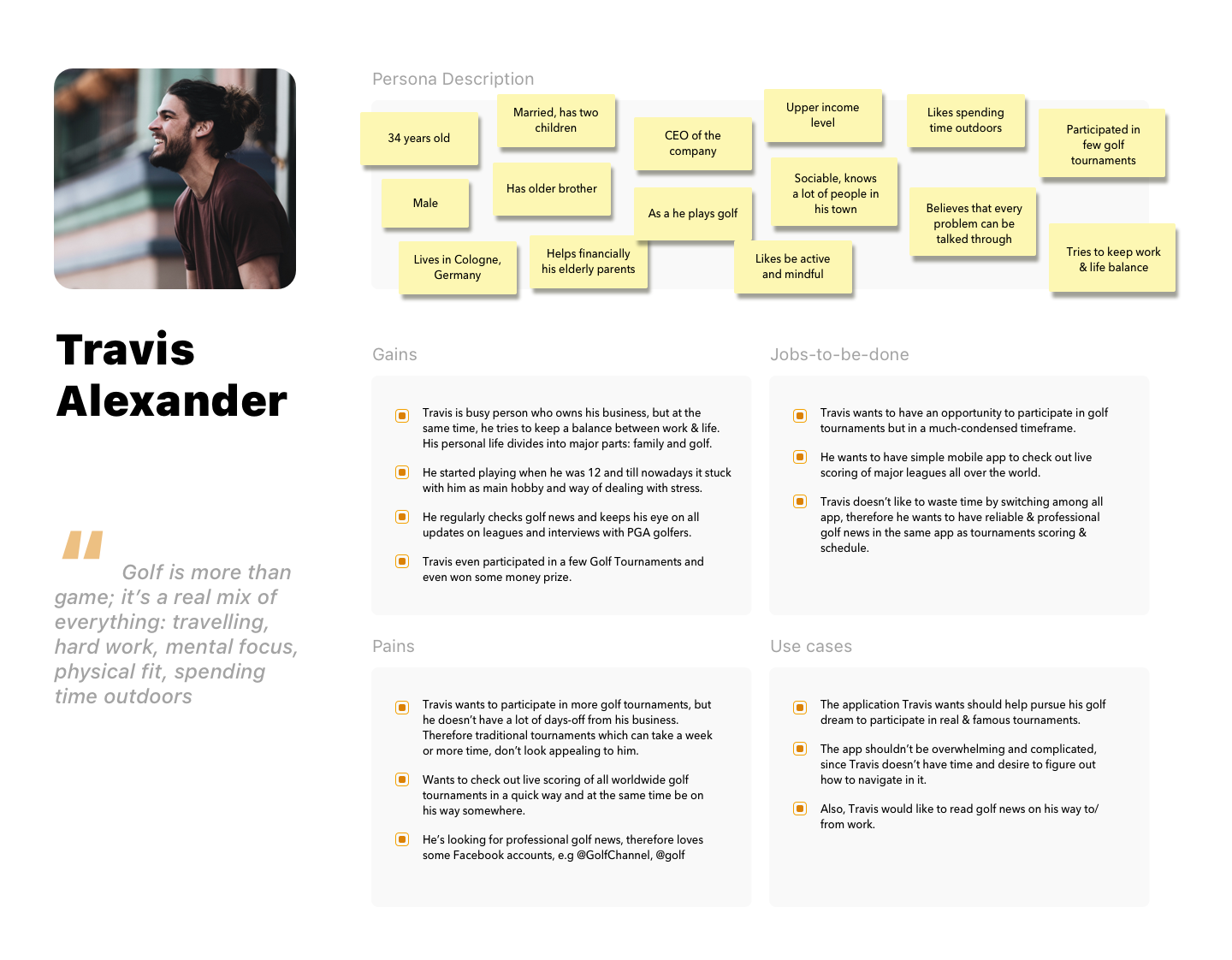
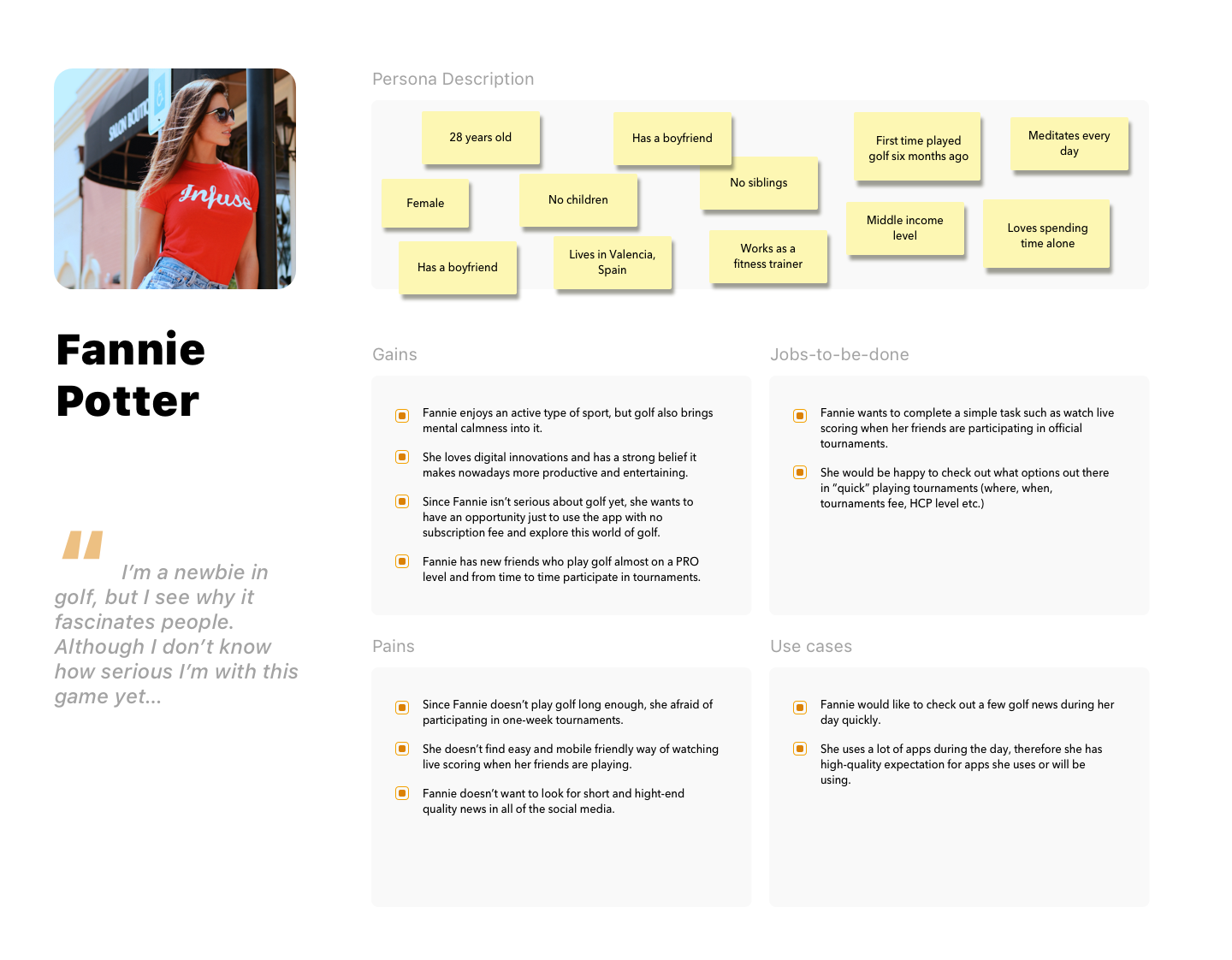
Based on our findings from user interviews and surveys, I've created User Persona and built an empathy connection between our development team and our users.
The stakeholder had a unique and bold idea to fundamentally change the way people participate in golf tournaments, including the World Championship and Golf Tour Events. As the solo Product Designer on the project, I faced challenges during the Design Thinking process because I didn't have much prior knowledge of golf as a sport.
Our design challenge was to create a seamless tournament experience that allowed users to sign up, input their game results, and receive monetary or gift rewards with ease. To address this challenge, we focused on developing an intuitive user interface that simplified the process of registering for tournaments and entering results.
As my knowledge of golf was limited to a few movie scenes, my first step was to conduct extensive research through the internet, golf rule books, YouTube videos of golf lessons and tournaments, and reading Golf News. Additionally, the stakeholder, who is a golf player himself, was a great resource in helping me navigate questions and confusions regarding golf play structure and tournament rules.
Based on our findings from user interviews and surveys, I've created User Persona and built an empathy connection between our development team and our users.
I designed IA based on all of the findings I gathered from competitive analysis and user interviews and surveys. Below you see a high-level overview of project components:
I designed IA based on all of the findings I gathered from competitive analysis and user interviews and surveys. Below you see a high-level overview of project components:
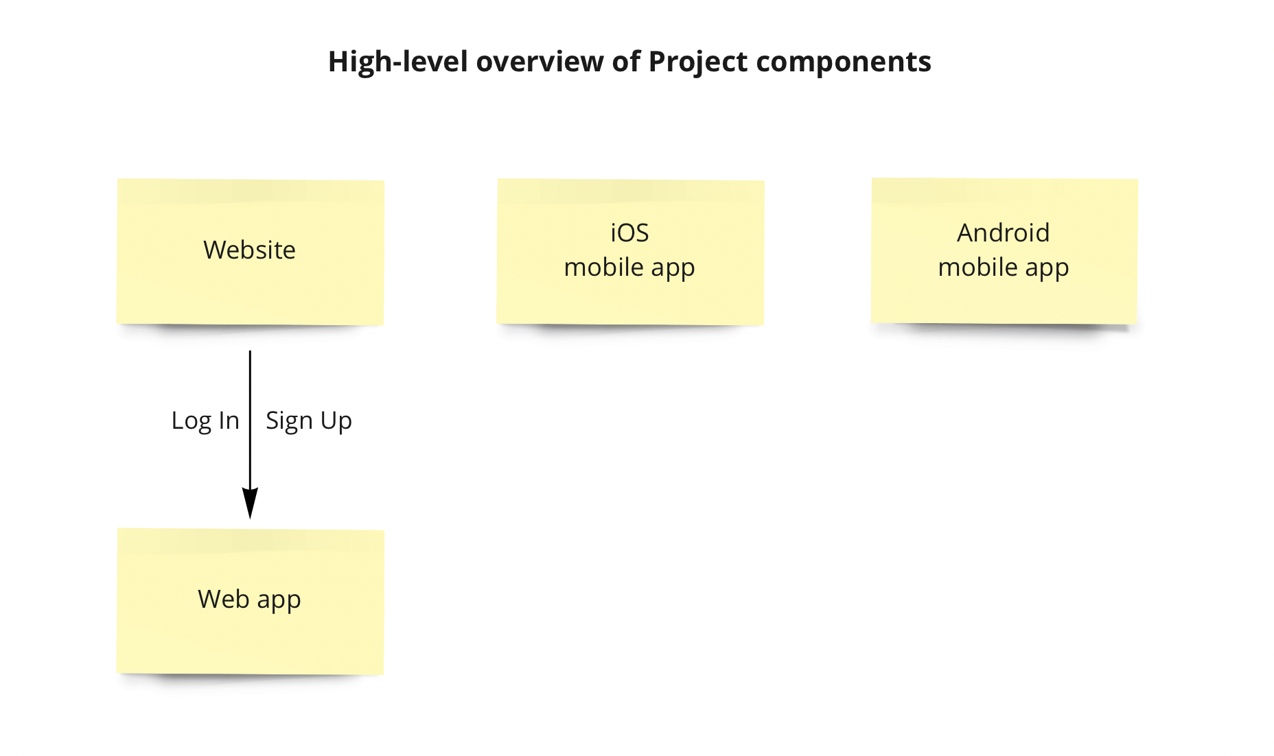
From there, I focused on each part at a time: iOS/ Android mobile app; Website; Web app.
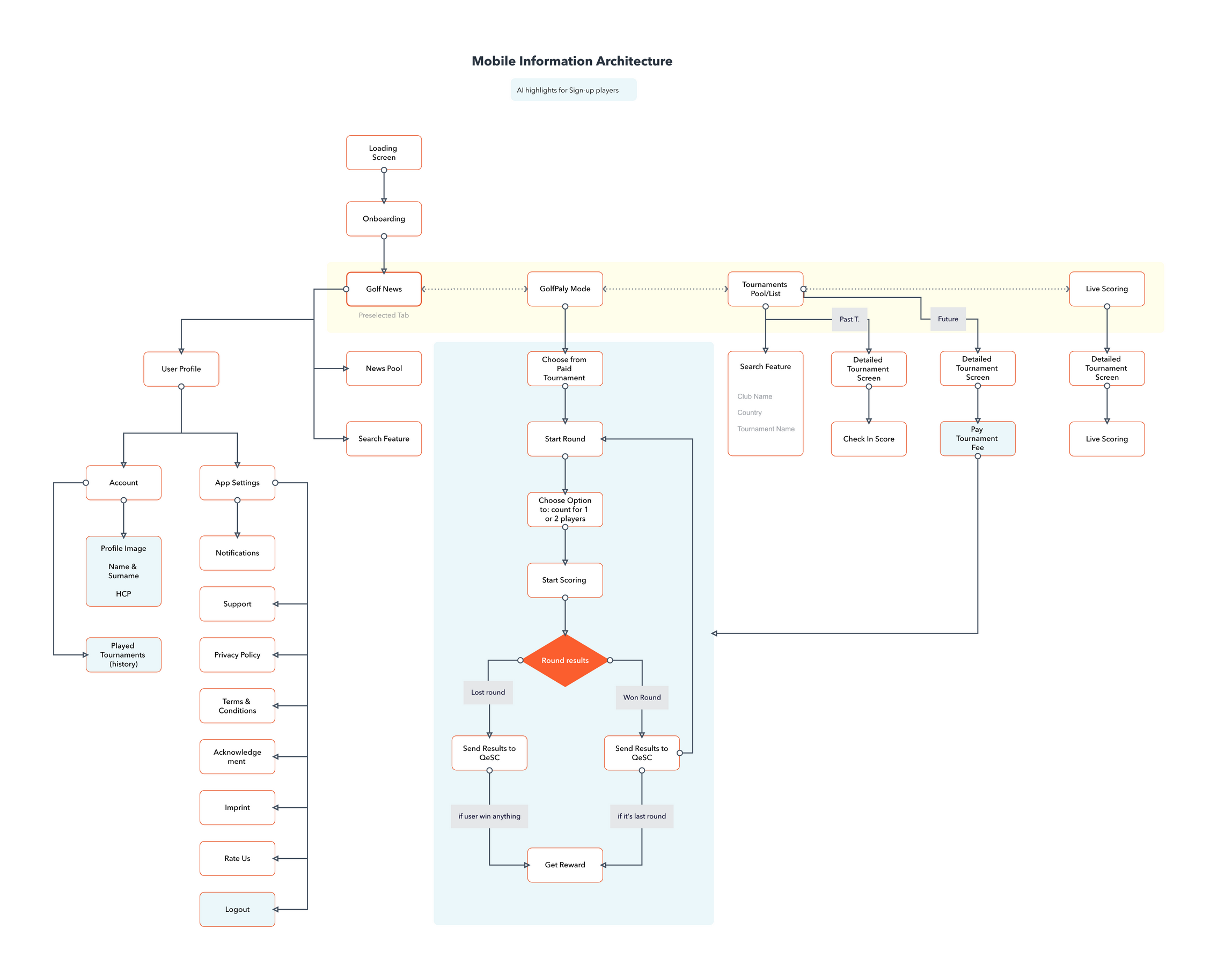
IA for the mobile app is representing the app's key features and navigation through the app. It also highlights the difference of IA based on user type [guest or sign up user]
From there, I focused on each part at a time: iOS/ Android mobile app; Website; Web app.
IA for the mobile app is representing the app's key features and navigation through the app. It also highlights the difference of IA based on user type [guest or sign up user]
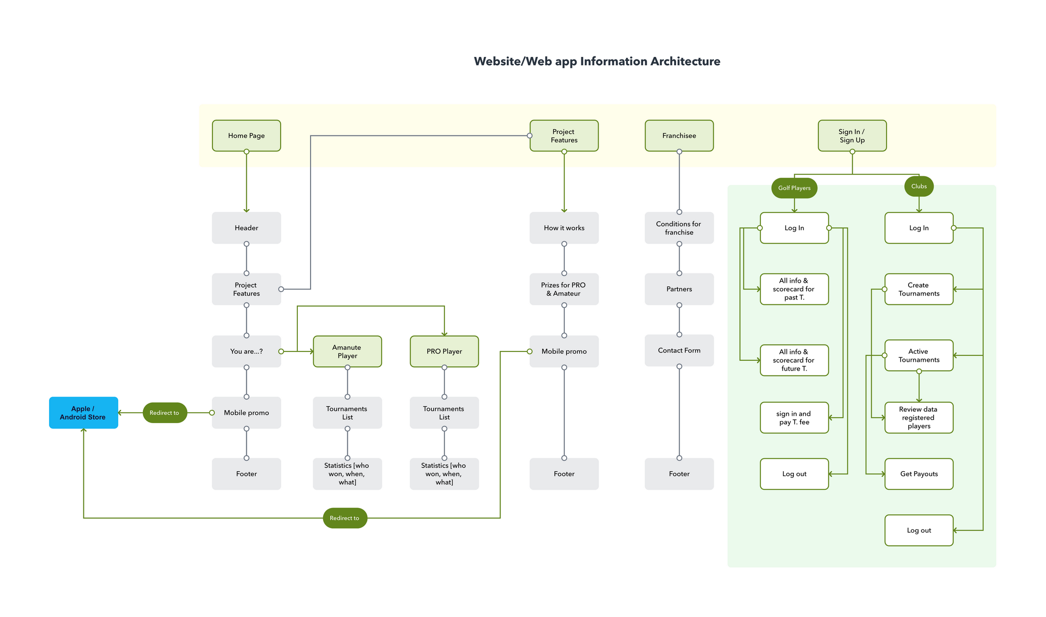
The same work has been done for detailed IA for website & web app with essential features and user goals & navigation in mind.
The same work has been done for detailed IA for website & web app with essential features and user goals & navigation in mind.
After the time spent on working on Information Architecture (IA), we run a brainstorm among the teammates [which contains developers, stakeholder and me] in the project to make sure we all are aligned on what we have so far and brainstorm ideas/suggestions.
After that, it was time to focus on wireframes with constant reminders of all the information gathered from user interviews and the business idea itself.
Following our work on the Information Architecture (IA), we held a brainstorming session with the project team, which included developers, the stakeholder, and myself, to ensure that everyone was aligned on our progress and to generate new ideas and suggestions.
Next, we turned our attention to wireframing, keeping in mind all the information we gathered from user interviews and the business concept. We created several iterations of wireframes, followed by prototyping and usability testing, to evaluate the user experience and gather feedback on how we could improve the product's design and functionality.
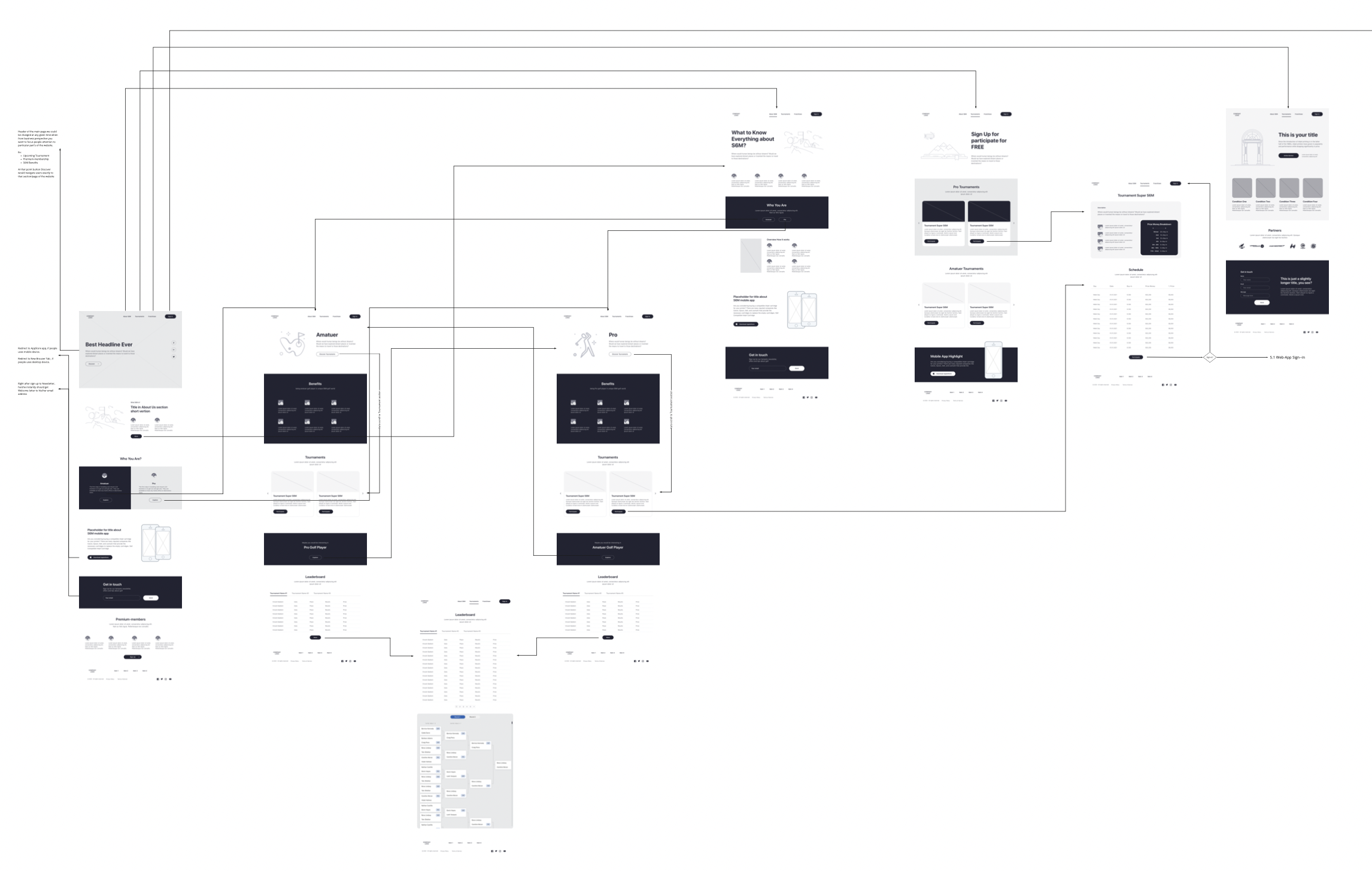
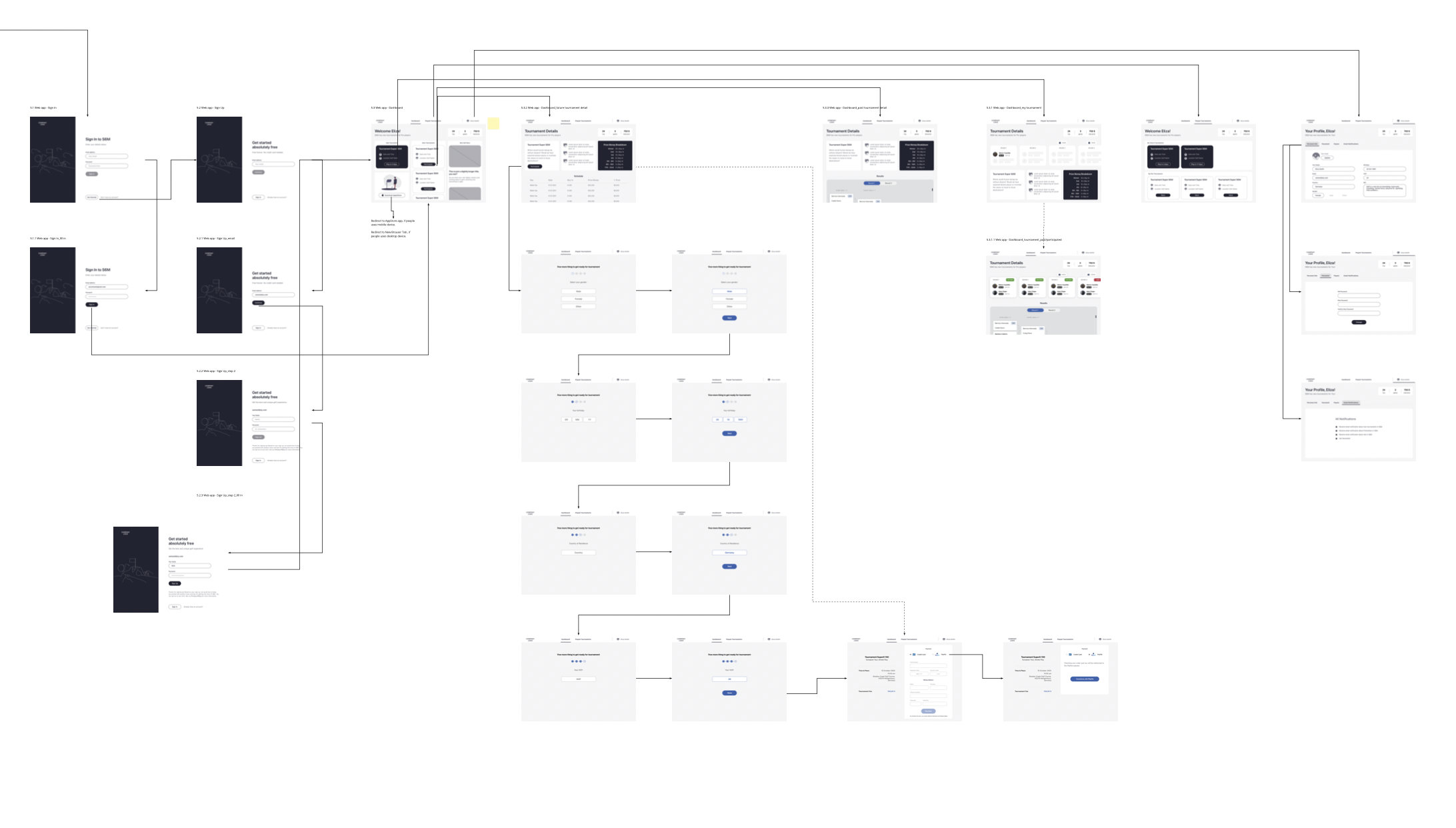
With wireframes for the entire project and quick prototype in InVision, we run remote user testing to ensure that the architecture of each section of the project is clear and didn't cause any confusion for the user while the went through a set of the tasks such as:
After we gathered user's feedbacks, it took time to analyse it and made according adjustments, e.g. create two different types of scorecard [one view for PRO golfers & other for Amateurs]
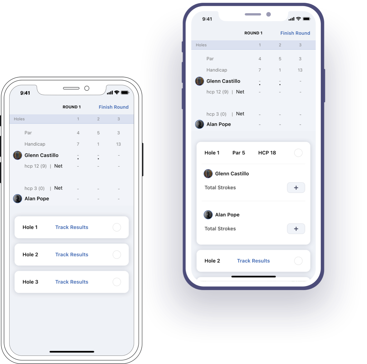
As we moved into the visual design phase, we realized that we had tight deadlines to meet during my meeting with the stakeholder. However, this wasn't a big problem since we already had clear requirements for the project's UI. The interface had to be primarily white and clean, with the brand colors used for main emphasis and CTAs.
Once the visual designs were completed, I delivered the files to the developers along with design specifications and requirements for navigation, animations, and component descriptions.
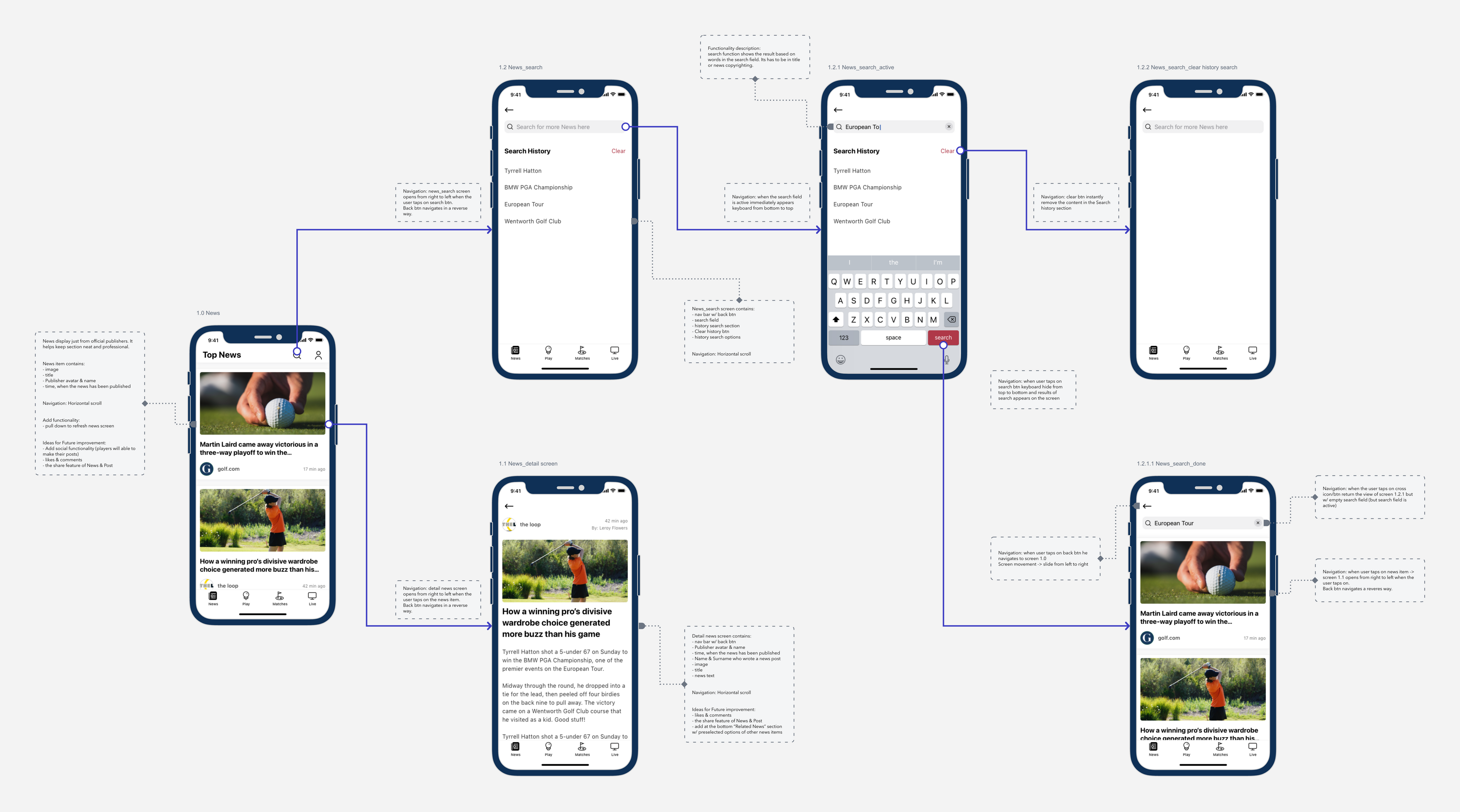
Here is a sneak peek of some of the requirements provided to the developers:
It was about time to focus on visual design, but we figured out that we have tight time deadlines during my meeting with stakeholder. This wasn't a big problem since we already had precise requirements for Project UI: the interface has to be primarily white and clean with brand colours for main emphasis and CTAs.
By the end of work on visual designs, I delivered the files to developers with design specifications and requirements to navigations, animations and component descriptions.
Sneak peek to small part of requirements for devs:
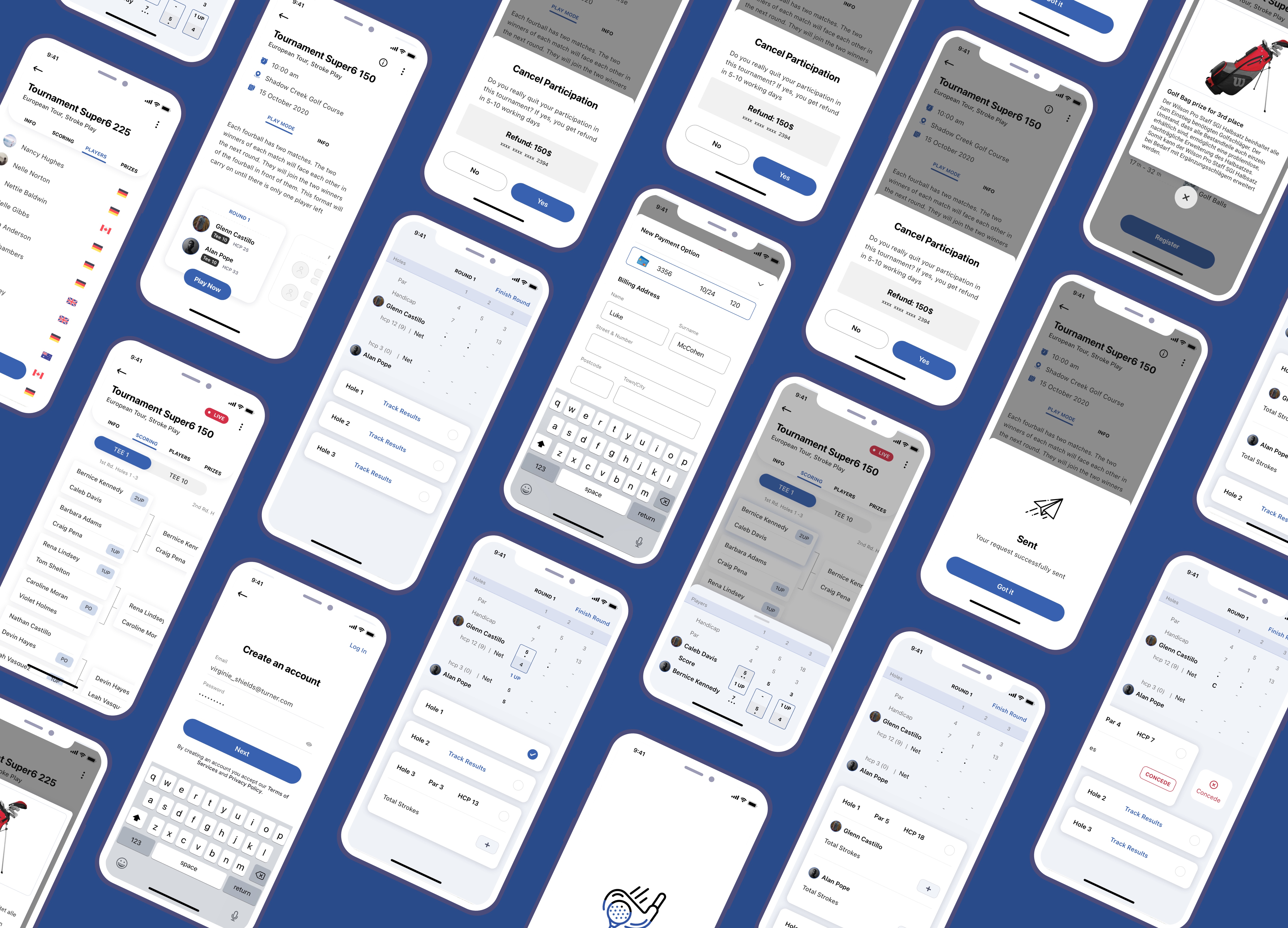
Quick overview of Visual Design
Quick overview of Visual Design
At the end of this Case Study, I have to pinpoint few essential things since this project was a journey with its bumpy roads:
I had a great time doing this project and overcoming my fear and nervousness. I frequently reminded myself that if I divide the entire process into small tangible tasks and stick to the plan step by step, I won't feel overwhelmed and can provide the best result.